Red is considered a warm color, and it’s one of the colors that comes to mind first when you talk about fire, heat, or warmth. It’s a color that demands attention. It makes an eye-catching accent color in the home. It is also possible to use red as a main color in your decorating palette, although you’d have to be confident in your choices to want to bring it to the forefront as a primary focus in your decorating scheme.
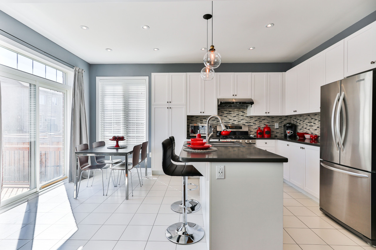
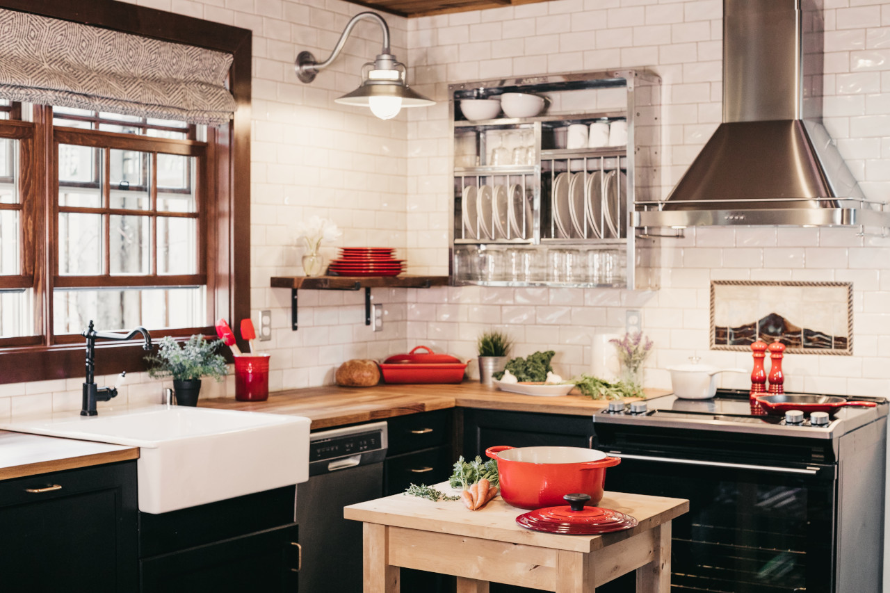
Lately, it has been trendy to use red as an accent color to decorate spaces that are primarily furnished with combinations of black, white, and gray. You can see a couple examples of this in the kitchens pictured here; the red dishes make fantastic accents in these environments.
Many different reds are attractive choices for use in interior design. Vibrant, lipstick reds are gorgeous in contemporary designs. Deep brick reds and burgundies combine well with a variety of different beiges, browns, camels, hunter greens and other colors for use in traditional spaces. The classic red and white kitchen remains a favorite with many decorators and homeowners as well.
Choosing Which Red Color to Use in Your Home Interior Color Palette
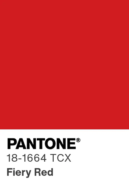
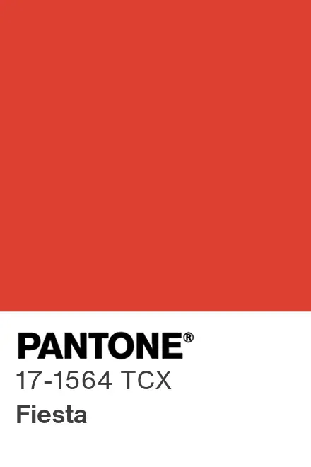
Right now, “Fiery Red” and “Fiesta” are a couple of the trendiest red colors for apparel. Frequently, fashion trend colors transfer and become broadly popular for home decor, too. Since “Fiery Red” and “Fiesta” are such key colors right now, these are a couple of those shades that are likely to become stylish for interior spaces. If you’d like to decorate with red, but you aren’t sure which one to choose, those particular shade of red are worth taking a look at. But it only makes sense to use one of these if it works with the other colors in your decorating palette.
There are tricks to choosing which shade of red would work best with your other furnishings at home. The main thing to keep in mind is that you have to evaluate colors in relationship to each other.
On the color wheel, red falls between orange and purple. So, at one end, there are orange-y, tomato reds; and at the other end, there are deep shades of wine, burgundy, and purple-red. In the middle, there are true, primary reds.
There are clean, bright reds, and then there are muted, grayed-down reds. If your decorating palette consists mostly of “clean” colors, you’d also want to choose a clean, vibrant red, too. If you are decorating with grayed-down colors, a pure, clean red will make your other colors look dirty and dingy in comparison. So in that case, you’d want to choose a grayed-down, muted red that would harmonize.
So there you have it: Those are some of the most important basics to keep in mind when you decorate with red. I hope this info is helpful to you as you work on choosing new red decor for your home. Happy decorating!
References and External Links:
- At the Pantone Website: London Fashion Week Color Trends for Spring 2024
- At the Creative Commons Website: One (BUT NOT ALL!!!) of the photos on this page was made available under a Creative Commons license.